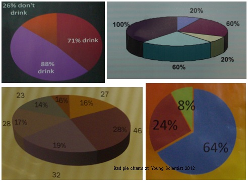
Young scientists need better pies
This is the time of year when the Young Scientist exhibition takes place in Dublin, and my two lads and I spend a few hours going around the exhibits to see what manner of scientific exploration the children of this island have been engaged in for the past several months. It really is a fascinating exhibit, and a lot of credit is deserved by so many people, the organisers, the teachers, the judges and especially the many schoolchildren who participate.
This year, however, the three of us began to notice a common problem. It would seem that quite a lot of our budding scientists cannot illustrate statistics. Very few of the presentations used appropriate charts or diagrams for the types of data being presented. There was little sign of trend lines, error bars, non-linear scales etc. Instead, most people were relying on bar and pie charts, the latter being particularly bad. Pretty soon the three of us were hunting for prime examples of pie charts gone bad, a few samples shown here:

No doubt these were produced by feeding numbers into a spreadsheet, but a little care and attention would have ensured that the right data, within the right bounds, in the right order and with a common context would have been selected for presentation. Being able to add would also help. There was some public debate recently about the quality of the teaching of mathematics in our schools. One can see why people were concerned.
Categorised as: LUE